The choice of cladding materials and finishes shapes the overall perception of an interior long before the furniture. Enhancing a home involves a technical reading of the volumes, natural light, and recent regulatory constraints on air quality, as much as it requires a sensitivity to colors and textures.
Formaldehyde Emissions and Decorative Furniture Choices
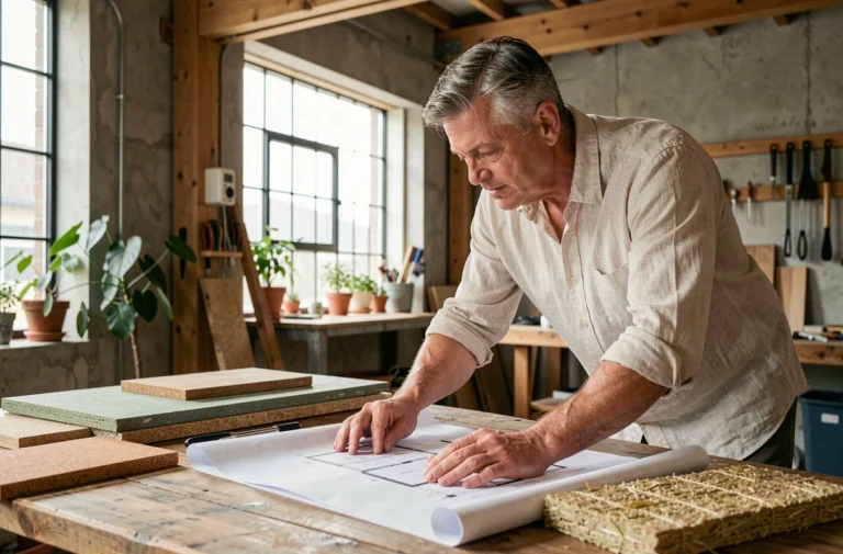
The REACH regulation now imposes a maximum threshold of 0.062 mg/m³ of formaldehyde for furniture and wood-based products placed on the market. This constraint directly alters the selection of decorative pieces made from particle board, MDF, or plywood.
We recommend systematically checking the emissions labeling before purchasing a bookshelf, console, or TV unit. Cheap lacquered finishes are often the highest emitters. A polyurethane varnish applied in the workshop, with complete drying, significantly reduces off-gassing.
For interior design enthusiasts looking to reconcile aesthetics with health requirements, Ludivine Passion offers pieces and accessories that take these technical criteria into account.
Vinyl wallpapers with high grammage pose a similar problem: their plasticized layer traps moisture and can promote VOCs trapped in the adhesive. Opting for non-woven wallpaper with water-based inks remains the safest solution for dressing a bedroom or living room wall without degrading air quality.
Architectural Lighting and Color Temperature by Room
Poorly calibrated lighting neutralizes any decorative effort. The layering of light sources (general, functional, ambient) is a given. What distinguishes a well-designed interior is the choice of the appropriate color temperature for each space.
Living Room and Living Spaces
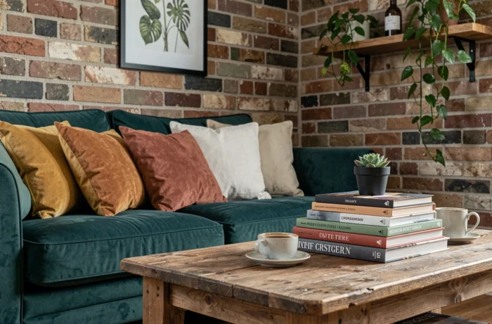
We observe that temperatures around 2,700 K remain the standard for a warm living room. Going below this value (LED candles at 2,200 K) works for accent lighting but turns the room into a cave as soon as the main source is turned off.
A common mistake is to multiply recessed spots in the ceiling. This type of lighting produces harsh shadows under the eyes and flattens the contours of the furniture. An indirect floor lamp aimed at the ceiling, combined with wall sconces, restores volume.
Office and Remote Work Space
Hybrid office-living spaces have become widespread. The lighting in the work area should reach a cooler temperature (4,000 K) to maintain concentration, while the rest of the room retains a residential ambiance. A magnetic track with adjustable spots allows switching between the two settings without altering the installation.
Decorating Hybrid Rooms: Office, Bedroom, and Relaxation Space
The rise of remote work has created a need for rooms that can change function in a matter of minutes. The decoration of these spaces adheres to specific constraints that classic decor advice does not address.
- Foldable furniture (wall-mounted drop-down desk, textile sliding partition) allows for visually masking the work area at the end of the day, cutting the mental load associated with the screen
- The colors in the office area benefit from remaining neutral and matte (warm gray, ash beige) to limit visual fatigue, while the rest of the bedroom can accommodate more saturated shades
- A relaxation corner (reading chair, plants, soft lighting) set opposite the workstation acts as a sensory counterpoint to screen time
Ergonomics is now integrated into decoration rather than opposing it. Manufacturers offer height-adjustable desks with solid wood or linoleum tops, and residentially designed work chairs. Ergonomic furniture no longer needs to be hidden.
Color Palette and Wallpapers: Building Consistency Between Rooms
Decorating each room in isolation produces a disjointed interior. Chromatic coherence is built from a palette of three to five shades deployed throughout the house, with variations in intensity according to the spaces.
The most reliable common thread remains a dominant neutral (off-white, greige, light taupe) occupying walls and ceilings, punctuated by a character color reserved for architectural elements (niche, baseboard, headboard) and an accent shade limited to textiles and accessories.
Panoramic wallpapers are making a strong comeback to dress a unique wall in each room. On a bedroom wall, a muted botanical pattern creates depth without overwhelming the space. The classic mistake is to place this type of wallpaper on the wall facing the room’s entrance: it is better to position it on the perpendicular wall so that it reveals itself gradually.
Style and Natural Materials
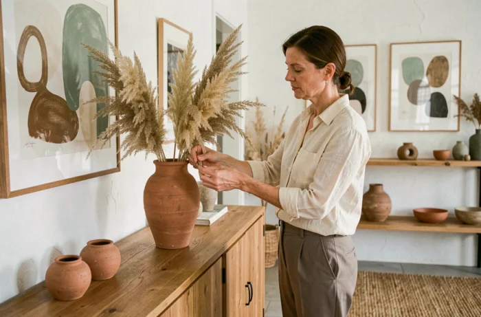
Raw materials (washed linen, terracotta, brushed wood) add texture to a neutral palette. We recommend combining at least two contrasting materials per visual zone: a linen cushion on a tanned leather chair, a stoneware vase on a light oak console. This play of textures advantageously replaces the accumulation of decorative elements.
DIY projects in macramé or air-dry clay allow for the introduction of unique pieces at a low cost. These handmade elements bring a visual irregularity that industrial furniture cannot replicate, personalizing an interior without resorting to an overabundance of objects.
An interior that works over time relies on deliberate technical choices rather than the accumulation of seasonal trends. Air quality, the accuracy of lighting, and the coherence of materials form the invisible foundation of successful decor, the one that is not seen but felt at every moment spent at home.